Compare and Contrast
Compare and Contrast
Finally, let's discuss the last feature of the Peasy Trace Visualizer: comparing and contrasting multiple traces. When selecting traces to visualize upon launching the trace visualizer, you can choose to select multiple JSON traces at once.
We suggest that you place all the trace files in one folder to facilitate easier selection in the file dialog window.
View Different Traces
The trace visualizer interface for viewing multiple traces remains mostly consistent, with a few exceptions. On the left panel, alongside the Log lines and Motifs tabs, there is now a Clusters tab as well. Furthermore, within the central graph panel, there exists a dropdown option for selecting the different traces that have been chosen. Lastly, located at the upper section of the right panel, there is an PAIRWISE option which we will discuss shortly.
Demo Video: How to visualize multiple traces in trace visualizer?
In the video demo below, we visualized three traces and switched between them by selecting the corresponding option from the dropdown in the central panel.
Trace Clusters
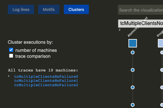
The new Clusters tab at the top of the left panel allows us to separate traces into different groups based on a chosen metric between number of machines or trace comparison.
-
Clustering by the
number of machinesgroups traces from the smallest to the largest number of machines. In the example below, with the three traces that we selected earlier, they all have the same number of machines.
-
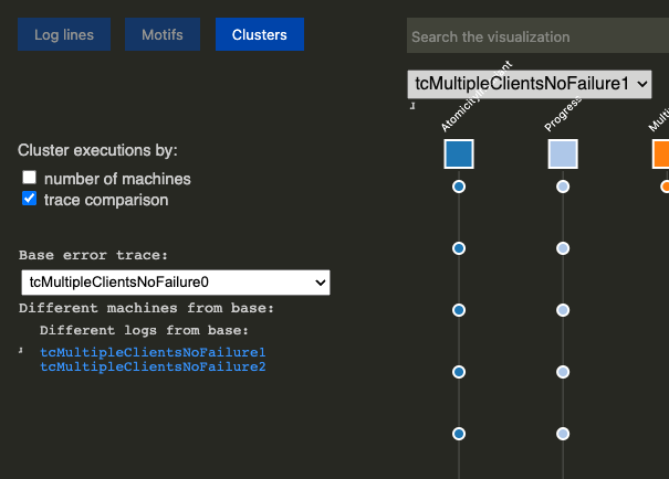
Clustering by the
trace comparisongroups traces to provide an overview of how the traces differ from a selected base trace. When choosing to cluster bytrace comparison, a dropdown menu appears to select a base trace. Subsequently, options become available for selecting traces that have either the same or different logs as the base trace, as well as traces with the same or different machines. In the example below, as all three traces have different machines from each other and contain varying logs, only the sub-category ofDifferent log from baseunder theDifferent machines from basecategory is shown.
Pairwise Comparisons
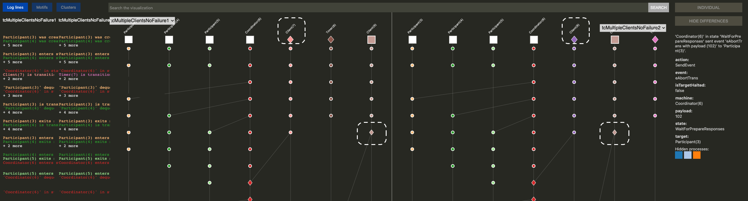
Beyond viewing the traces individually, the trace visualizer also supports a side-by-side comparison. You can click the PAIRWISE button at the top of the right panel to view two traces side by side. When in PAIRWISE mode, another option appears at the top of the right panel called SHOW DIFFERENCES. Clicking SHOW DIFFERENCES will highlight any differences between the two traces in the graph (center panel) by presenting them as diamond shapes.
- The diamond shape indicates that a machine/node is present in one trace but not in the other. Below, you'll find some images to assist you.
-
In the top row of machines, we observe that
tcMultipleClientsNoFailure1(left side) corresponds to the machine namedClient(7), andtcMultipleClientsNoFailure2(right side) corresponds to the machine namedClient(8). The diamond symbol displayed onClient(7)withintcMultipleClientsNoFailure1indicates thatClient(7)is present intcMultipleClientsNoFailure1but not intcMultipleClientsNoFailure2. -
We can also observe a diamond-shaped node under the machine
Client(9). In the context oftcMultipleClientsNoFailure1, this node corresponds to the log entry:
Conversely, in'Client(9)' in state 'SendWriteTransaction' sent event 'eWriteTransReq with payload (client=Client(9), trans=key="3", val=8, transId=202)' to 'Coordinator(6)'.tcMultipleClientsNoFailure2, the node corresponds to a different log entry:
The notable distinction between these two nodes lies in their payloads, which are distinct.'Client(9)' in state 'SendWriteTransaction' sent event 'eWriteTransReq with payload (client=Client(9), trans=key="8", val=2, transId=202)' to 'Coordinator(6)'.
There you have it! Now, go ahead and try out the trace visualizer yourself to debug your P program!